


 By guest - August 17, 2026
A person in Qatar can move through several digital services before lunch without thinking much about it.
They might check a bank account, make a mobile payment, access a government service, book an appointment, order something online, or log into a work platform. These services solve completely different problems, but every smooth interaction leaves behind an expectation.
When one platform confirms a payment immediately, an unclear transaction elsewhere becomes more frustrating. When one service remembers information and makes a repeat task simple, entering the same details again on another platform starts to feel unnecessary.
This is an important consequence of Qatar's digital growth.
Digital transformation does more than put services online. Over time, it changes what people consider convenient, clear, and acceptable.
For businesses, that raises the standard. Having an app, website, or customer portal is only the starting point. Customers increasingly notice how much effort it takes to get something done.
Qatar Is Raising the Baseline for Digital Convenience
Qatar's digital development now reaches government, finance, business, payments, AI, and everyday consumer services.
The country's Digital Agenda 2030 sets out a broader roadmap for digital transformation, covering areas such as digital infrastructure, government services, technology adoption, innovation, and economic development.
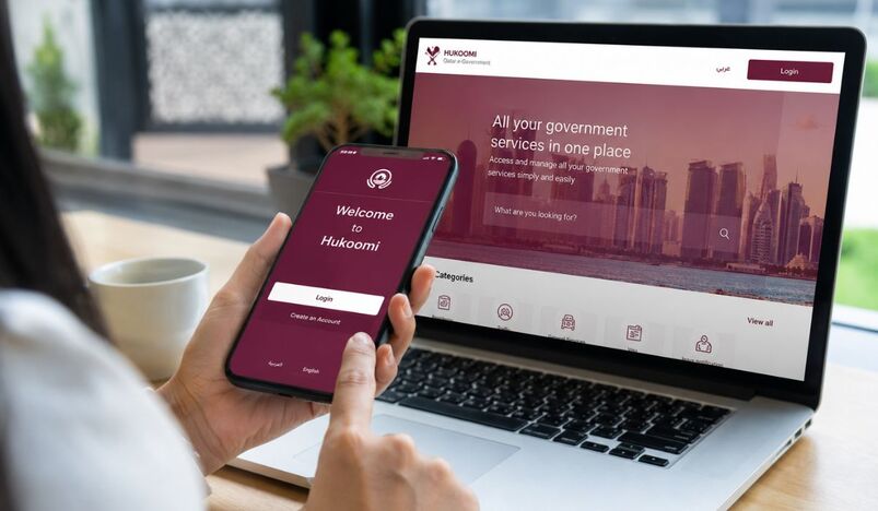
Public services provide a useful example of how expectations are changing. The enhanced Hukoomi platform brings government services together with features such as personal profiles, transaction tracking, multilingual support, smart search, single sign-on, and document management.
Instead of simply making individual services available online, the direction is increasingly toward making the complete interaction easier to navigate.
Qatar is also continuing to expand digital payments, fintech capabilities, AI programmes, and support for businesses adopting new technology. These developments matter beyond the sectors where they happen because people gradually become accustomed to faster payments, simpler authentication, clearer status tracking, and better mobile services.
As a result, the question starts to shift from “Can I do this online?” to “Why does this still take so much effort?”
Users Compare Experiences Across Industries
Customers do not usually evaluate digital experiences according to neat industry categories.
Someone using a banking app in the morning does not forget that experience when they visit an e-commerce site in the afternoon.
If the bank confirms a transaction immediately, they learn to expect clear feedback after an important action. If a government platform allows them to track a request, a business portal displaying only “Processing” may feel less informative. If an online store remembers delivery details and simplifies the next purchase, a repetitive registration form elsewhere becomes much more noticeable.
This does not mean every customer in Qatar has identical expectations. It means the broader benchmark for digital convenience is being shaped by experiences across multiple industries.
A business is therefore not judged only against its closest competitor.
Customers may also compare it with the easiest digital services they already use.
That makes user experience a wider business issue than visual design alone.
A Strong Product Can Still Be Difficult to Use
A company can have a valuable service, competitive pricing, capable technology, and useful features while still losing customers because the journey around those things creates unnecessary work.
The problems are often ordinary.
Registration may ask for information that does not seem necessary. Navigation may use internal terminology instead of language customers understand. A form might request a document without explaining the required format. Checkout may add steps without a clear reason. A dashboard may contain plenty of information but make the most important data difficult to find.
Individually, these issues can seem small. Together, they can determine whether someone completes the task or gives up.
For businesses reviewing these journeys, thoughtful customer journey design can help identify where onboarding, navigation, forms, mobile interactions, and other important touchpoints are adding avoidable friction.
The important shift is to look at the process as the customer experiences it.
Internally, registration, verification, payment, and account setup may belong to different departments or systems. From the customer's perspective, they are usually one journey: getting started.
That difference explains why adding another feature does not always improve the experience. Sometimes the more valuable change is removing a step, rewriting an instruction, simplifying a form, or making the next action obvious.
Faster Is Useful, but Clearer Is Better
People naturally expect digital services to be fast.
Pages should load without unnecessary delay. Payments should process efficiently. Users should not have to repeat information that the service already knows.
But speed alone does not create a good experience.
A form might load instantly while leaving someone unsure which document is required. A payment might process within seconds but end with a confirmation screen that does not clearly state whether the transaction succeeded.
In both cases, the technology is fast, but the task is still unclear.
Clarity comes from understandable labels, useful validation, visible progress, sensible defaults, and clear feedback after important actions.
These improvements can also create practical business benefits. If customers understand a form the first time, they are less likely to abandon it or contact support. If payment confirmation is clear, fewer people need reassurance about whether they were charged. If onboarding explains what happens next, fewer users become stuck before reaching the value of the product.
Better UX often reduces effort for both the customer and the business.
Mobile Should Not Feel Like the Compromised Version
For many users, there is no distinction between the “mobile experience” and the “real experience.”
The phone is simply where the task happens.
Qatar's payment ecosystem illustrates how important mobile interactions have become. Qatar Mobile Payment supports mobile payment services within the country's financial infrastructure, while customers increasingly expect to handle other everyday tasks from their phones as well.
That includes booking appointments, uploading documents, checking requests, shopping, managing accounts, and making payments.
Yet some services still treat mobile as a smaller version of desktop. Long forms become tiring, tables require horizontal scrolling, uploading a document involves too many steps, and important actions can become buried inside navigation designed for larger screens.
A responsive layout does not automatically solve these problems.
Responsive design makes the interface fit the screen. Good mobile UX makes the task practical on that screen.
The difference becomes obvious when businesses test complete journeys instead of individual pages.
A better test is whether someone can register entirely from a phone, upload the required document without changing devices, complete a payment confidently, and recover from an error without losing everything they entered.
Those tasks reveal much more about mobile quality than whether the layout simply looks tidy.
Bilingual UX Has to Work as One Experience
Qatar's audience includes people from a wide range of linguistic and cultural backgrounds, making language an important part of many digital services.
Arabic and English support therefore needs to go beyond translating text.
Interfaces may need to account for RTL and LTR layouts, navigation direction, forms, numbers, terminology, mobile behaviour, and what happens when someone switches languages halfway through a task.
A user might begin a process in English and switch to Arabic because another person is helping them. They may change languages to compare terminology or better understand one particular instruction.
If that action sends them back to the homepage or clears information they already entered, the language option has created friction rather than removed it.
A well-designed bilingual service should preserve the journey wherever possible.
The wording and layouts may differ, but users should feel that Arabic and English are two supported versions of the same product rather than one primary experience and one translated copy.
Trust Is Built in the Small Moments
User experience becomes particularly important when a digital action involves money, identity, personal documents, or other sensitive information.
These moments leave little room for ambiguity.
After pressing a payment button, for example, a customer should immediately understand whether the transaction succeeded. If the result is unclear, they are left deciding whether to try again and risk being charged twice or stop and hope the first attempt worked.
Good confirmation removes that doubt.
It can show the amount, transaction status, reference number, receipt information, and next step where relevant.
The same principle applies to account verification, document submission, bookings, and other high-trust actions. Users need feedback that matches the importance of what they just did.
A polished interface may create a good first impression, but reliable feedback is what helps people trust the service when something actually matters.
Real-Time Updates Are Changing What Good Service Feels Like
Another expectation being raised is visibility after submission.
People have become accustomed to tracking deliveries, seeing booking updates, receiving payment notifications, and checking the progress of requests without having to contact support.
Qatar's digital government services are moving in the same direction. The enhanced Hukoomi platform includes transaction-tracking capabilities, and Qatar Day's coverage of the enhanced Hukoomi platform highlights the effort to make government interactions more connected and easier to follow.
Experiences like this can influence expectations in private services too.
Consider a healthcare request, insurance claim, booking, delivery, business application, or support ticket. A status such as “Pending” describes the system state, but it may still leave the customer unsure whether the request was received, whether additional information is needed, whether someone is reviewing it, or whether they will be notified when something changes.
A more helpful message might say:
“Your request has been received and is being reviewed. No action is required from you at this stage. We will notify you when the review is complete.”
The process has not become faster, but it has become much easier to understand.
That distinction matters because uncertainty itself creates work. People may check repeatedly, contact support, or submit the same request again when they do not know what is happening.
AI Works Better When the Basics Already Work
AI is becoming a larger part of Qatar's digital development, including initiatives such as the government's GovAI programme.
Businesses are also exploring AI-powered search, chatbots, recommendations, personalization, automated support, and smarter dashboards.
These tools can improve digital experiences, but they are not a substitute for getting the basic journey right.
A chatbot that quickly directs someone to a confusing form has not solved the underlying problem. An AI recommendation engine cannot compensate for a checkout process people do not trust. Automated support should not become a permanent workaround for navigation customers cannot understand.
AI works best when it builds on a clear product experience.
It can shorten the route to information, improve discovery, or reduce repetitive work. Once the user reaches the task, however, the fundamentals still matter: clear language, sensible steps, useful feedback, and straightforward recovery when something goes wrong.
Where Qatar Businesses Should Start
Improving UX does not mean redesigning an entire digital product.
A better starting point is to identify the journeys that matter most.
For an e-commerce business, that might be product discovery and checkout. For fintech, onboarding, identity verification, and payments may deserve the most attention. For healthcare, appointment booking and access to results could be more important. For SaaS, the priority might be activation and the workflows customers repeat every week.
Once those journeys are identified, businesses can look for evidence of friction.
Which forms are abandoned? What questions repeatedly reach customer support? Which error messages appear most often? Where do customers take longer than expected? Which steps cause them to move backward or start again?
Analytics help identify where something is going wrong, while usability testing helps explain why.
Instead of asking users whether they like a website, give them a realistic task. Ask them to find a service, create an account, complete a booking, or submit an application, then observe where they hesitate.
That behaviour is usually more useful than opinions about colours, trends, or visual preferences.
Most importantly, businesses should fix known friction before automatically adding features.
A clearer checkout can be worth more than another recommendation tool. Better onboarding may improve activation more than adding another dashboard. A useful error message may prevent hundreds of support conversations.
After making changes, measure the journey again using relevant signals such as completion rate, abandonment, support demand, conversion, activation, time to complete, or retention.
A Quick Digital Experience Checklist for Qatar Businesses
Before adding another feature, businesses can ask:
- Can a first-time user understand the main action quickly?
- Can the most important journey be completed comfortably on mobile?
- Do forms explain requirements before mistakes happen?
- Are Arabic and English experiences equally usable?
- Can users switch languages without losing progress?
- Are payments and submissions followed by clear confirmation?
- Do status messages explain what happens next?
- Can customers recover easily when something goes wrong?
- Have important journeys been tested with real users?
- Are recurring support questions pointing to problems the interface could solve?
A negative answer does not automatically mean the product needs a major redesign.
Sometimes the most valuable improvement is one removed step, one clearer instruction, or one better explanation at exactly the right moment.
Digital Growth Changes the Standard
Qatar's digital transformation is creating a more connected environment across government, finance, business, payments, AI, and everyday services.
The deeper effect is that every successful interaction helps redefine what users consider normal.
A clear payment experience influences expectations for the next transaction. A trackable government request changes how people think about status updates. A smooth mobile service makes an awkward mobile form stand out.
Businesses do not need to respond by adopting every new technology or constantly redesigning their products.
They need to understand the journeys that matter most to customers and remove the friction that prevents those journeys from working well.
As Qatar's digital economy develops, good user experience will increasingly feel less like an extra feature and more like part of the basic standard people expect.


_20-08-2026_05-08.jpg)
_27-51-2026_11-51.png)
_27-43-2026_12-43.png)



.jpg)
.jpg)




.jpg)


.jpg)
.png)
.jpg)













Leave a comment